Azur Clean Tinati
Site for a Nice cleaning company
Role
Developer - brand implementation, site, booking flow
Client
Azur Clean Tinati, Nice
Links
The problem
The company had a visit card, a French company brochure and no web presence. Everything - brand, structure, copy, booking flow - had to be derived from paper.
The approach
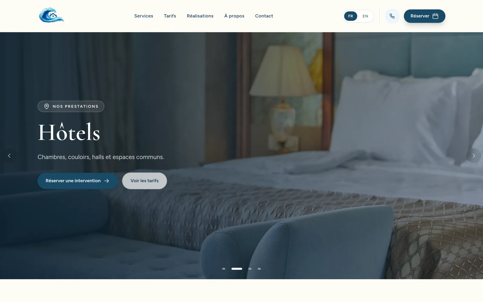
French-first bilingual site with a plain reservation form, service and pricing pages, and a job gallery. Deliberately calm: no ambient motion anywhere, at the owner's request.
Tale of the tape
Live
for a real Nice business
FR / EN
French-first bilingual
First
web presence for the company
Decisions
Deleting the feature I was proudest of
I built a full availability system - capacity, blocked days, occupancy, an admin calendar. The owner did not want it: she confirms dates by phone and showing occupied days would expose how busy she is. I removed the whole apparatus and shipped a plain date form instead. The client's business reality beats my nicer architecture.
Using the real artwork instead of my redraw
I traced the logo as an SVG from a blurry angled photo and got the shape wrong. The correct move was to ask for a clean crop and use the owner's actual painted artwork. Approximating someone's brand is not a shortcut worth taking.
No animation, because the client said so
I proposed an animated wave hero. It was rejected in favour of a real photograph. I deleted the keyframes rather than arguing for them, and the site is calmer for it.
Stack
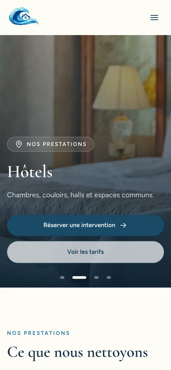
On a phone
Also on the card